
David Brown’s Top-Shelf Carton Design for Mixicles
Mixicles® offers all the ingredients for premium, hand-crafted cocktails pre-mixed into a frozen cube form. Bartenders and other consumers need only add the alcohol or other beverage. Cog’s David Brown, Structural Design Specialist, reports on our partnership with Emma Jones and Redshoe Branding Communications (Mixicles’ agency) and Mixicles co-founders, Jennifer Morales and Jason Stitt. Together we created an innovative and production-feasible package design that could excite consumers about a product type nobody had seen before.
Take it away David:

IMAGE COURTESY OF MIXICLES | FACEBOOK.COM/MIXICLES
“In our first customer consultation with Mixicles, Jen and Jason shared their initial carton prototypes and empty, square Mixicles ice trays. The challenge they faced was creating a package that could be stored in the freezer and opened multiple times by bartenders and other consumers. When opened, the package needed to be easily accessible from the side rather than from the top.
An important presentation for Jen and Jason was looming, so naturally, we were all under a huge time crunch. We had two weeks to turn their present version into a more functional, more graphically exciting carton that would wow the client’s merchandising team.
Our first step was to design a new carton structure.
After sketching out a number of concepts in pencil, both as folding cartons and then die lines, I created them in Adobe Illustrator. Cog’s Roland LEC printer/cutter printed score lines and marks, and then produced a variety of white, folding mockups. The Roland LEC allowed Cog to create rapid paperboard prototypes by letting me revise files as I went. That way, I could be sure what I saw on screen would come out as proof-in-hand.
The importance of clear communication came home to me in a big way. In my designer brain, a six-sided box has a top, bottom, front, back, a left side and a right side. When the customer described their initial want, they used the word ‘side’ to tell me where they wanted the opening to be. I was surprised to learn that, for them, the box had a top and bottom and four sides!
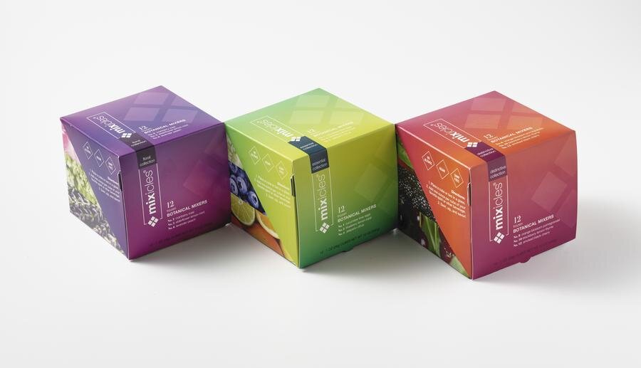
IMAGES COURTESY OF MIXICLES | FACEBOOK.COM/MIXICLES
Concept #1 could have been easily turned around so the product faced out, but the clients already loved Concept #2 with its front graphic panel that could be lifted to reveal the product. The view from either side was also unique from most cartons in a store, owing to the separate, overlapping panels.
Cog shared the die lines with Emma Jones, a designer and owner of Redshoe Branding Communication, to apply artwork. When back in our hands, we completed printing and die cutting. The mockups were then hand scored, glued and presented to the Mixicles team. They loved what they saw!
Mixicles’ presentation to the client was a success. Feedback from the meeting guided us to a way to improve the initial design. I had to put in a lot of late nights to get it right, because I was heading home to Ireland later in the month. My Cog teammates discussed the structural design with a local printer. We wanted their assessment of how the carton would actually go through the presses and bindery machinery, and what changes to the design would work best. We decided on a design that would print as a single piece without need for gluing.
Since Cog works with production feasibility in mind, I didn’t expect many significant changes or recommendations.
We did agree on the following improvements and modifications to the main structural design, though.
A new folding, glued locking-base was critical.
Instead of glue, the side panels on the lid had a locking catch hidden inside the top panel.
A horizontal graphic panel received a locking tab.
A new tear-off panel on the inside front (when the lid is lifted) could be used as a menu card. This panel was needed for structural reasons in printing, but the customer would tear it off to access the cube trays.
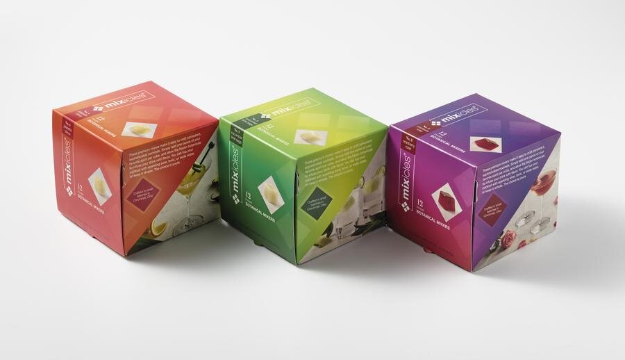
After producing a successful, white prototype, we shared this new die line with Emma, who went on to create beautiful graphics for several different flavors. We produced fully functioning printed prototypes for them. What we discovered to be critical to the structural design was that it needed to fold flat for mechanical gluing and pack-out.

IMAGE COURTESY OF MIXICLES | FACEBOOK.COM/MIXICLES
Jen and Jason enthusiastically approved the design. Apart from a couple of minor tweaks, the in-store products you can find today are virtually identical to Cog’s design, which was a relief to Jen and Jason because eliminating re-work accelerates speed-to-market.
This is a great example of how Cog works. Our process is more holistic in nature than, for instance, an agency’s or your garden variety comp house. The work we create can’t be hypothetical. It must function as a product and a brand in the real world, as well as on the computer screen. Instead of passing unresolved issues right along to the next person, team, or company in the supply chain, we solve them first. We understand the limits of any one individual’s knowledge and expertise, and always seek input whenever it is necessary. Our partners at Mixicles were with us 100%, and the results showed it.”